maker's assist
app interface design
overview
For the Makers Assist App, we partnered with the Neil Squire Society to help them design a UI/UX for their newly created LipSync device. The LipSync device helps quadriplegics navigate their mobile devices with the control of their mouth only.
What the LipSync could not do was press hardware buttons and perform complex finger gestures (ie. swiping). Together with the Neil Squire Society, we determined that the best solution is a UI overlay that would convert these issues into simple click buttons.
The goal was to create an effective user experience that could make mobile devices easy to use for quadriplegics as they are for any able-bodied person. Through the process of user research, idea proposal and user testing, we created the final UI overlay design that is most intuitive for quadriplegics.

research
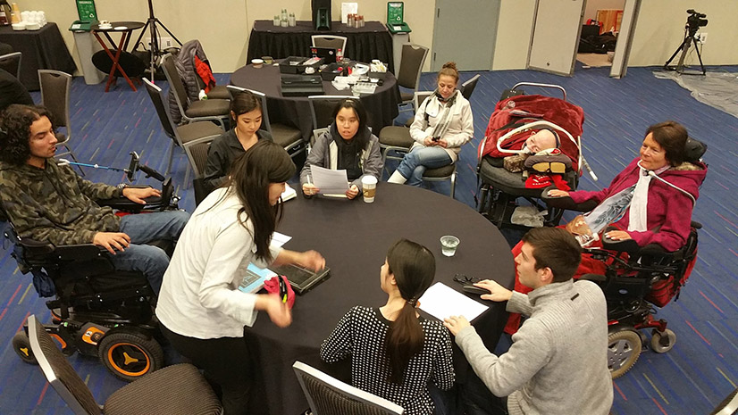
The first step after meeting with Neil Squire Society was to conduct user research. This meant looking at solutions made by competing companies and meeting with users to learn about their habits and routines. Only after understanding our users could we move onto ideating possible solutions.
proposal
Our research showed that users wanted to modify the environment to their own needs. After a process of ideation, we decided on a 2-level menu system with user customization.
initial design
During the initial design of the UI overlay, we created a fully interactive axure mockup to simulate the mobile devices we were using. This mockup was embedded into an android application so that users could test the LipSync with the mockup.
testing / struggles
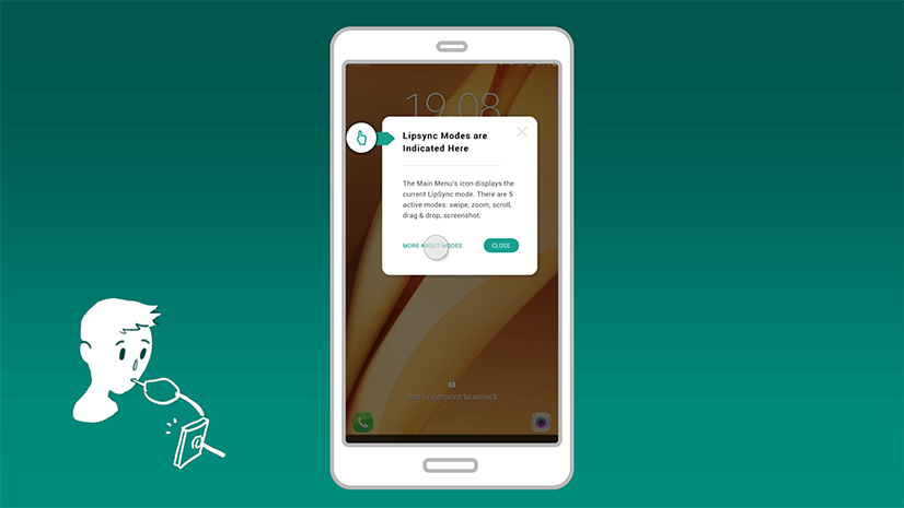
Using our initial design, quadriplegics tested our mockup with their own LipSync device. It was here where we discovered the inherent problems with the LipSync, and the challenges in designing for a device that is still in development. While we didn't receive the feedback we expected, we did find that users struggled to understand how the LipSync worked. This gave us an opportunity to embed this information into the UI, and hopefully have users understand the LipSync before they incorporate it to their mobile device.

final design
Ultimately, our concentration was not on building features into the application. Rather, we worked to streamline the onboarding and customization of the UI and the LipSync device. With the focus on user experience, we were able to learn a lot about understanding the users while working with clients. This made the implementation of the system easy for the developer at NSS, so that he could concentrate on the code rather than the process of the project.